MyAccount
Direct Energy

THE PROJECT
I joined the UX Team of Direct Energy Business in 2015 to help revitalize the customer account management system, MyAccount. MyAccount had been pieced together from legacy systems and felt clunky to use and looked outdated. I helped lead this redesign and coordinated efforts of our UX team, the outside research and development firm, and our development and IT groups.
EXISTING MYACCOUNT
We knew that MyAccount needed a redesign, but we did not have much data on customer satisfaction or usage. I began the research stage using resources available to us. I interviewed our internal sales and customer service users to get perspectives, user goals, and testimonials from external users.
We found three main issues: 1) users were primarily focused on payment information and usage data, 2) the navigation system was easily overlooked, 3) the payment process was confusing. I also used Google Analytics to look at page views, behavior flows, time on page, and exit pages. This data confirmed our internal users’ feedback, while highlighting the two most central issues to users: invoices and payments. Based on this research, we had identified specific areas that we could improve for users. We also noticed a gap in direct customer feedback for MyAccount. We decided that the redesign should include a new customer feedback tool, in which users could rate their satisfaction with the system and leave comments.
EARLY DESIGN
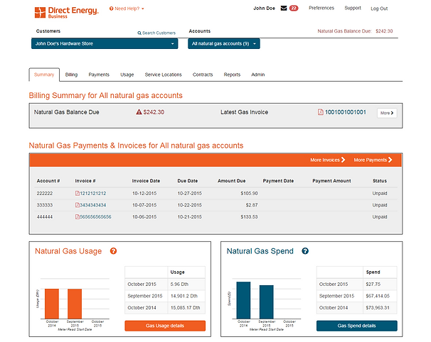
With navigation, invoices, payment process, and usage identified as our central areas of concern, I moved forward with the new design. I created wireframes for the homepage, payment process, and navigation system. To make the navigation system easier to use: I reorganized the page structure in a more logical way, renamed navigation titles with clearer descriptors, and included icons to further help users identify navigation links. For the homepage redesign, I simplified the information on the page and focused on providing billing and usage data in a clear manner. We wanted to get the vital information up front. I made wireframes with shortened payment processes and included all payment functionalities on one page to avoid customer confusion. I used Balsamiq to quickly generate wireframes, share them with the UX team, and enhance them based on feedback.
Account Details
Reorganized the home page content to call out important account information
Navigation Menu
New styling to call out the navigation menu
Payment Button
Added a payment button to better call out where you can make a payment
Useful Links
New section with links to helpful information
TESTING
After I created several wireframe options, we prepared for UX testing. We reviewed wireframes, chose which options to test, and came up with questions for users regarding MyAccount features. We then met with the research and design firm which would do our user testing. We worked on testing strategy and finalized questions. I sat in on the final user testing sessions and took notes. After their firm and our customer research team developed a report, we picked a final design and modified aspects of it based on user feedback.

DEVELOPMENT
After final modifications, our development team built and implemented the new designs based on my wireframes and notes. I worked with the UX developer, as well as the back end developer, as they implemented the new designs. After the implementation, I verified and tested the build to ensure the system was working and looking as intended. I conducted additional UAT testing after the program went live.

RESULTS
We had positive results from the redesign. We saw increased numbers of payments go through the system. Additionally, the customer feedback tool has proved very useful in keeping track of satisfaction levels and customer issues.
MYACCOUNT 2.0
In 2017, Direct Energy Business wanted to revise and re-brand MyAccount. At the time, MyAccount provided different experiences depending on if you were a small or large business customer. Working with the copy writing and graphic design teams, I helped create a universal experience for all MyAccount users.
Starting the project we listed out the business requirements and goals for the update. The main project goal was to create one experience for all users regardless of account size. In addition, we wanted to work on some issues we received from customer feedback about showing contract information and basic menu navigation. To address these goals our strategy was to streamline the home page, update how contract information was displayed, and revise the navigation menus.
REDESIGN
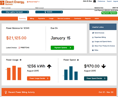
To create a universal experience we started with the navigation menu. The previous menu design had pages as different tabs with icons and a sub-tab bar for tabs with multiple pages. Through customer feedback we found that users had confusion finding specific pages with this design. For the new design we decided to go with a drop down menu that reorganized the hierarchy to focus on categories: usage, invoices, reporting, and preferences.
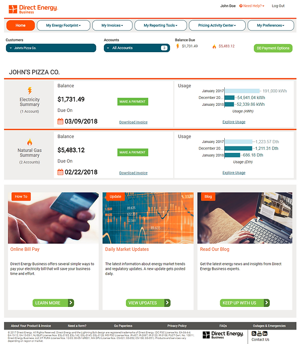
The next step was the home page. The existing home page for small business centered around usage while the large business home page emphasized invoices. In addition, the existing home page did not provide an easily digestible view of individual customers which was a big problem for users with multiple customers. For the new design we decided to remove information and page elements that weren't getting used much (the "Helpful Links" and payment information sections received little traffic). We then focused information at the customer level (rather than account or user level) by showing the usage and invoice information under a clearly defined customer name. This helped remove clutter from the page and focused the user on high level information that could be quickly read.

RESULTS
In late 2017 we went live with the new design. Tracking user feedback since the release, we have seen a significant decrease in complaints about the navigation menu and reported issues related to contracts. In addition, our satisfaction rating has increased by .4 (out of a 5 point likert scale) compared to surveys taken before the new design.